Many of Auckland's tactile indicators need to be replaced.
Tactile indicators are important environmental cues that help people detect changes and avoid danger in their surroundings – read more here. Unfortunately, we've seen a lot of issues in tactile installations around Auckland in recent years, with tactiles popping out and edges wearing down.
It’s not safe. It looks terrible. It's just not good enough for an international city of 1.5 million people, many of whom have vision impairments and mobility issues.
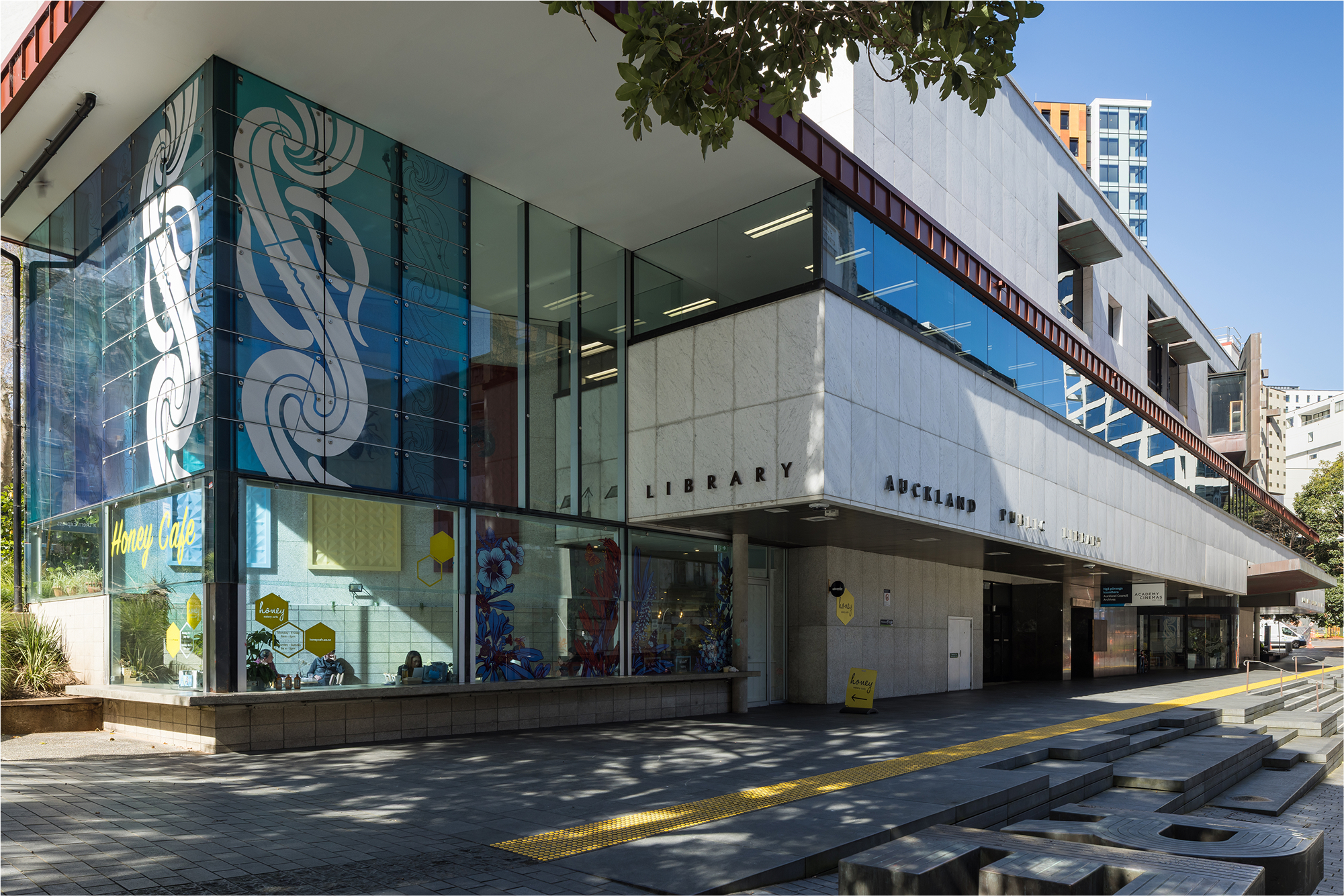
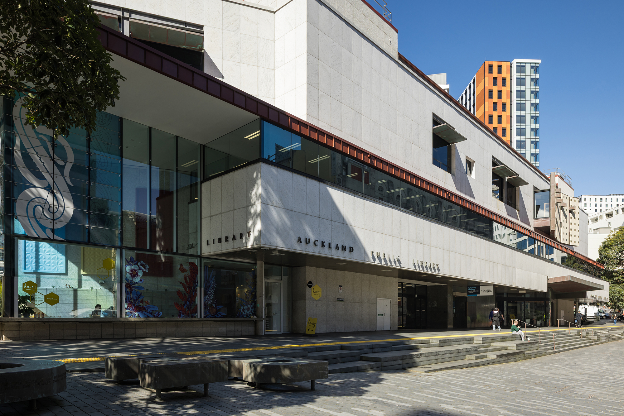
A prime example is Auckland City Library. Tactile indicators had previously been installed along the building's Lorne Street entrance to warn people of the steps nearby. However, these indicators had degraded over time – and some had actually come loose – making them less effective as safety measures.
Auckland Council and Downer NZ reached out to Freedom Works to supply and install new tactile indicators for the library. After discussion, our team also decided to handle the removal of the existing tactiles. This isn't our typical service, but we knew that a full-package solution would reduce delays and provide a better experience for our clients.
We removed the existing tactiles one by one to minimise construction noise. This method preserved the floating pedestal jacks upon which the streetscape tiles rested, eliminating the need for a time-consuming and strenuous replacement process.
Our installers also worked night shifts, ensuring less disruption to local businesses and library visitors. Freedom Works is proud to have such a dedicated team.
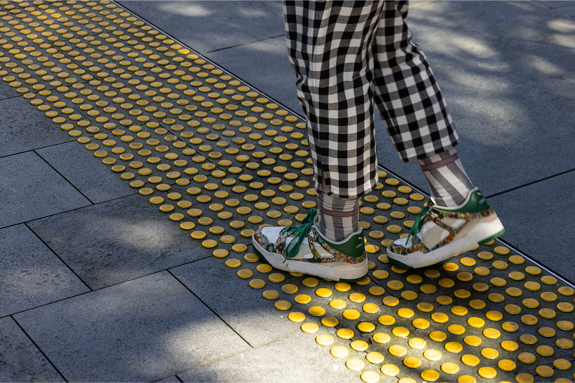
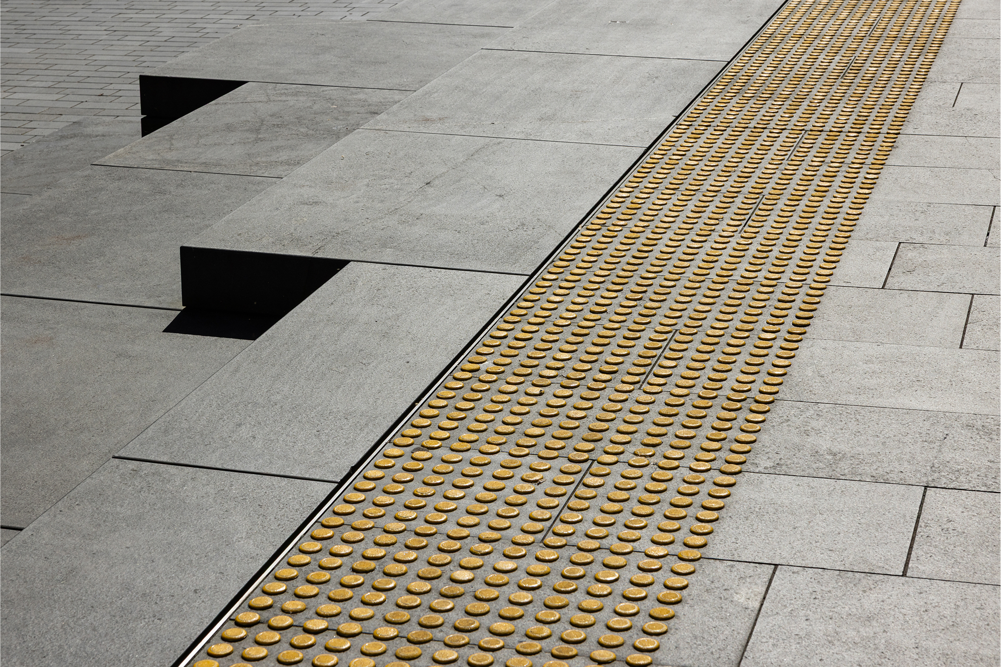
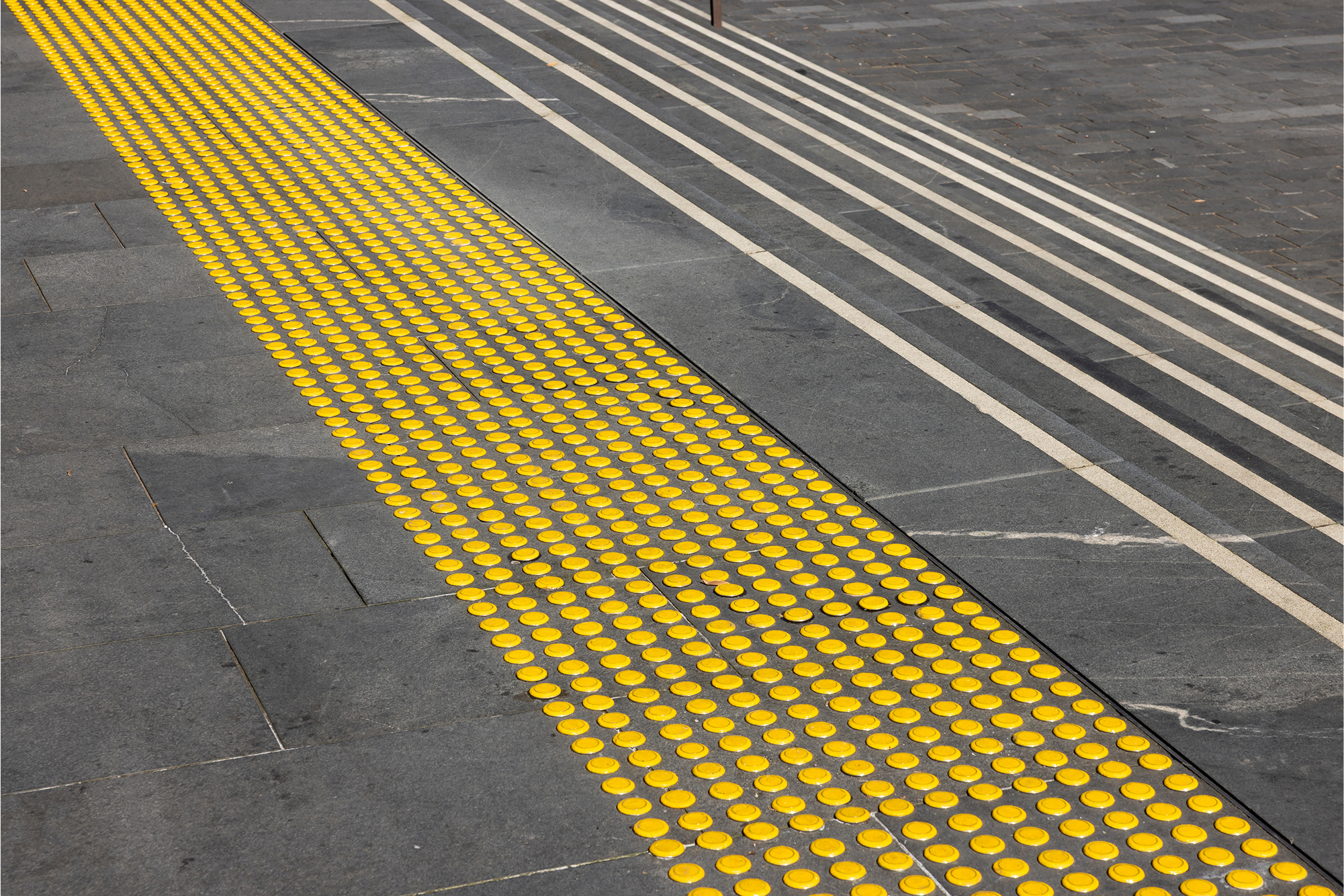
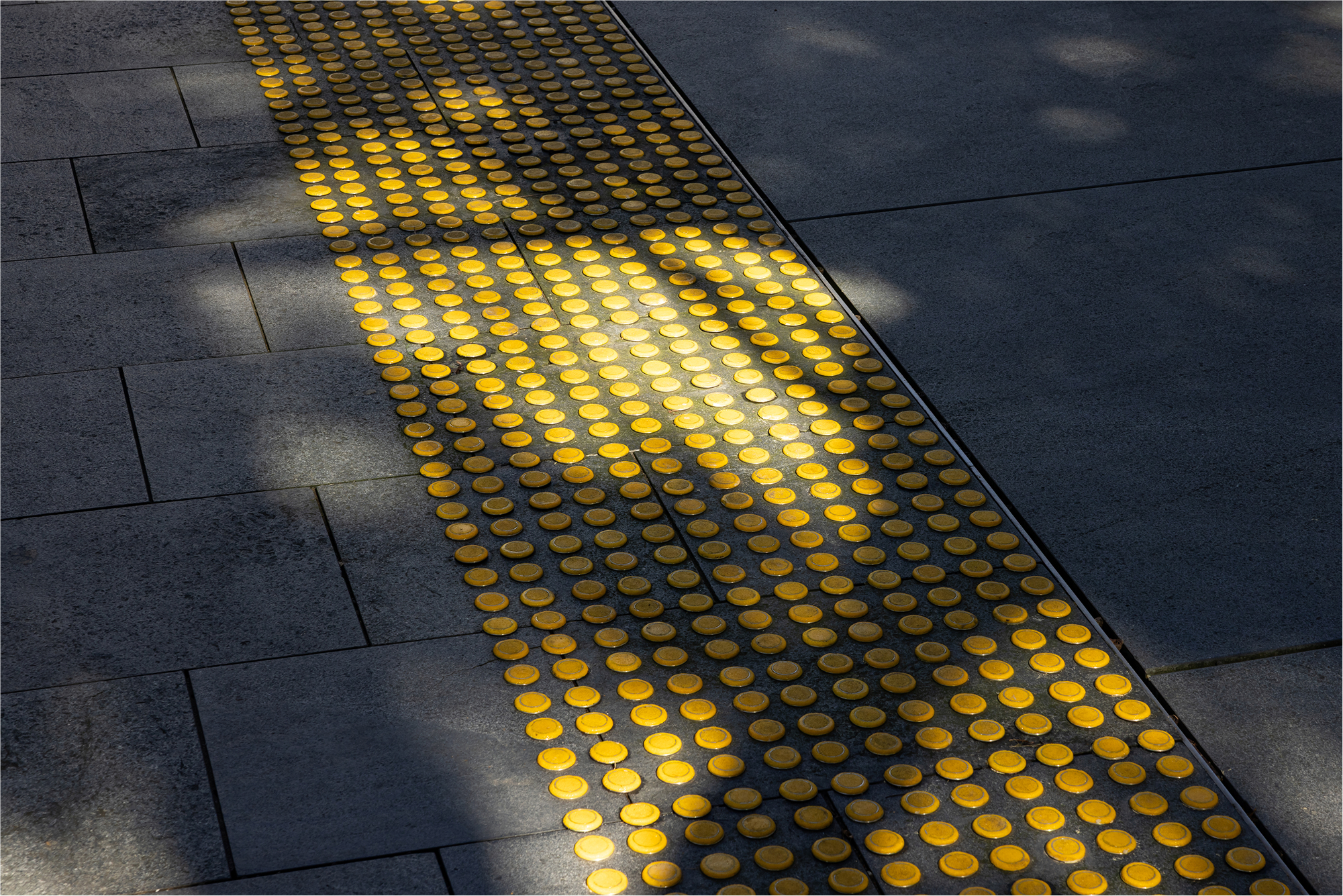
The tactile indicator studs used for the footpath were a unique design pioneered by Freedom Works, with every component specially chosen to suit the public transport setting.
Firstly, we made the entire stud face out of carborundum, an extremely hard-wearing material that is guaranteed to last well into the future.
Secondly, both the centre and the lip of the stud face were coloured yellow. Many other studs on the market only have coloured centres but not coloured faces, but we chose to incorporate more colour because yellow can sometimes be perceived even when other colour vision has been lost.
When it comes to public safety, every little bit counts – your product might be the only thing standing between a user and an accident.
We know that when tactile indicators aren't carefully designed, they're likely to break down and create a risk of accidents. After assessing the needs of the library environment, we switched from our standard 6mm indicator stems to a thicker 8mm stem to make sure our installation was as secure as possible. These studs also allowed our team to accommodate an access hatch in the streetscape, something that would not have been possible with paver-style indicators.
It was hard work, but well worth it: this shining ribbon of yellow tactile indicators will keep pedestrians safe around the beloved library.